Questionnaire results example:
Age: 17
Gender: male
What is your favourite magazine at the moment if any?
FHM, NME etc
…………………………………………………………………………………………………
What is your favourite band at the moment?
Bloc party………………………………………………………………………………………………….
What genre of music magazine do you prefer?
hip hop, indie
......................................................................................................................................................
How often do you read music magazines?
never
.....................................................................................................................................................…………………………………………………………………………………………………..
What would you like to see more of in music magazines?
interviews, pictures, information on tours
..........................................................................................................................................................……………………………………………………………………………………………………..
What do you buy music magazines for?
reading, information
………………………………………………………………………………………………
What do you think of the name ‘Granite’ for a music magazines name?
Better than others
…………………………………………………………………………………………………
Thanks for your time.
My questionnaire helped me to find out about what to include in my magazine and how to go about it. I learned that people generally liked the name 'Granite' and they mostly read music magazine's along with some others. They didn't really read music magazines as much because they didn't include what they wanted e.g. interviews, festival information e.t.c:
I will add all i learnt to the magazine to make it as good as it can be.
Thursday, 26 February 2009
Sunday, 22 February 2009
Preliminary photos


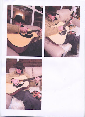
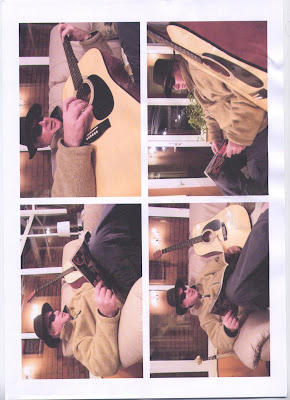
These are the preliminary photos i took of my father last week. One of these will be the photo of my main magazine cover but i will edit them using Photoshop to maybe cut out the background and just leave the main person and the sofa. I will decide which one with the help of my family and friends to see which they prefer out of the possible 7.
Thursday, 12 February 2009
Revolver front cover magazine analysis
 The metal magazine 'Revolver' has the same layout as Mojo but obviously with different style font and size and also it is alot darker than the other. This is probably because of the audience its aiming at but also it gives alot of focus on the colourful photo and the yellow highlighted main story which is also the magazines main selling point, the big band.
The title also shows less colour with its grey style and bold lettering.
I feel This magazine also has a very good balance of colours, photos and style which all dont take away from the individual look of the magazine but add to it, the information is clear and very stylish, the colour scheme is dark but suits the music and magazine and finally the way the photo is covered but also shows over some of the things on the magazine makes it look like its leaping out of the page.
In conclusion doing this analysis has given me a good idea how to balance the metal and rock music magazines styles together without looking jumbled and confusing. I am going to test out different styles for my final magazine front cover, contents page and double page spread.
Wednesday, 11 February 2009
These pictures are two parts of the same mock-up which is on A3 paper. It will feature a large centered photo of a band playing on or off stage will smaller pictures around the main article, it will have all the usual tag lines and such.
This is the second of three mock-ups which i will do in preparation for my magazine and next up will be my contents page.
This is the second of three mock-ups which i will do in preparation for my magazine and next up will
 be my contents page.
Tuesday, 10 February 2009
MOJO music magazine front cover analysis

MOJO Music magazine analysis of the front cover
The front cover for ‘MOJO’ music magazine is centred on one large photo which is usually the main story in the magazine. The title ‘MOJO’ is in the background behind the photo to give the photo more emphasis than the rest of the magazine, this is because of the fact that the main story photo needs to have the spotlight of the magazine to draw in readers and also to make the magazine look more appealing to any passers-by.
The ‘MOJO’ uses the large white lettering to make the magazine stand out more for its main headlines to draw more attention to them and make them leap out the page but the use of the smaller pictures are also carefully placed to again give more emphasis on the main story and picture.
The layout of the magazine is quite linear in comparison to others but it doesn’t crowd the magazine with too much information and gives it a good balance. The use of free additions on the magazine will also draw in more buyers.
Subscribe to:
Comments (Atom)


